
Guide
The AI website design playbook
How one prompt turned Grolia's homepage into something people screenshot, and the setup that makes a design model perform.
Most coding assistants now ship a model built for visual work. Claude Code calls its version Fable. Codex has Sol. Both make bold layout and type decisions quickly instead of cautious edits.
They perform in proportion to what you hand them. Point one at a page with no assets and no context and you get a competent reskin. Give it an image model, a design guide, the real product and permission to go big, and you get work you would pay an agency for. Same model. Different output.
Six things that make it perform
None of them are hard. All of them get skipped.
01
Give it an image model
02
Give it a design guide
03
Give it the real product
04
Say "creative freedom"
05
Make it critique its own work
06
Isolate the risk
Grolia: one prompt, one weekend
Grolia's old homepage was a working Shopify page. A plain product render on black, a generic hero, a simple nav. I wrote the prompt below, pointed Fable at the live theme with a Replicate key and the brand guide attached, and let it run three critique passes before I looked.
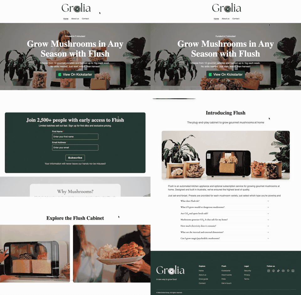
Before
- Product render on black
- Feature-grid layout
- No motion, no story
- Looked like a theme
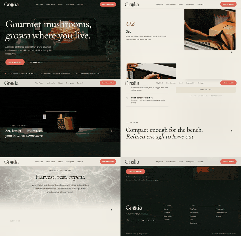
After
- Staged product scenes, generated on-brand
- Editorial layout, scroll-driven
- Motion that explains the product
- Looked like Grolia
It was built on a separate route, so the live store was never at risk. Reviewed, then shipped. It is live at grolia.com.au.
The exact prompt
Word for word. Most of it is context and permission, not instructions.
I want you to create a completely new, highly polished version of the Grolia landing page for Flush.

Do not replace the current homepage. Build this as a separate experimental route, for example /pages/landing, so we can review it safely while keeping the existing site live.

The goal is to show what Grolia can become as a premium, organic, beautiful product website. I want this to feel calm, intelligent, tactile, and aspirational: a clean branded website for a compact mushroom growing cabinet that helps people grow gourmet mushrooms at home.

You have creative freedom. Do not just lightly restyle the current page. Create a genuinely new concept that demonstrates excellent web design taste, strong art direction, and modern frontend craft. You can use advanced visual techniques if they make the page better: immersive product scenes, tasteful 3D, scroll animation, cinematic image treatment, elegant typography, soft motion, rich product storytelling, or generated visuals.

Use the existing Grolia brand guidelines as your foundation:
- Brand: Grolia
- Product: Flush
- Feeling: organic, calm, refined, premium, natural, beautiful, quietly technical
- Use the existing Grolia logo
- Use the current brand colours and typography direction where appropriate
- Do not make it feel generic SaaS, crypto, AI, or sterile tech
- Avoid loud gradients, plastic-looking UI, random blobs, and stock-photo energy

You may inspect the current landing page and reuse anything worthwhile: copy, structure, product positioning, existing photos, icons, social proof, Kickstarter messaging, or product assets. But you are not required to preserve the current layout.

You may also use the 3D unit model if useful, but make it feel significantly more premium than the current plain white box. For example, you could stage it beautifully, show mushrooms growing inside, use it as part of a scroll-driven product reveal, or combine it with generated imagery.

If using generated imagery would improve the page, use Replicate with Google Nano Banana 2 to create strong branded product visuals. Generated images should feel realistic, warm, and relevant to the product, not decorative filler.

You may also use Replicate for video generation, image-to-video, texture generation, product staging, or any other AI model that helps create a stronger result. If a short looping video, animated product scene, generated mushroom growth sequence, or cinematic background moment would make the landing page more compelling, create it and use it thoughtfully. Any AI-generated media should feel believable, premium, and directly connected to Flush or mushroom growing. Do not add AI media just because it is possible; use it only where it materially improves the brand story or visual quality.

Suggested content to communicate:
- Grow gourmet mushrooms at home with less effort
- Flush controls the growing environment so mushrooms can thrive
- Compact enough for the home, refined enough to leave out
- Designed for repeat harvests, not one-off grow kit novelty
- Choose gourmet varieties and harvest fresh mushrooms at home
- Explain the value simply: better growing conditions, less misting, less guesswork, more reliable results
- Include a strong Kickstarter / preorder CTA if appropriate
- Include sections for how it works, why Flush exists, what you can grow, key features, and FAQs if they help the story

Important design expectations:
- The first viewport should immediately communicate Grolia and Flush, with the product or growing experience visible
- The page should feel editorial and premium, not like a template
- Typography should be beautiful, readable, and controlled
- Use generous spacing, but keep the page purposeful
- Motion should support understanding, not just decorate
- Make mobile excellent, not an afterthought
- Avoid overcrowded cards and generic feature grids unless they are genuinely useful
- Every section should have a reason to exist

Implementation expectations:
- Build this as production-quality code in the existing Shopify/theme structure or the project structure available to you
- Keep the current homepage intact
- Put the new page at /pages/landing or the closest safe equivalent
- Reuse existing assets where useful
- Add any new assets cleanly
- Keep the page performant
- Make sure links, buttons, forms, and responsive behaviour work

Before you consider it done, complete at least three iteration passes:

Pass 1: Design critique
Review the page as if it will be seen by a large audience. Look for weak visual hierarchy, generic sections, awkward spacing, boring imagery, poor mobile layout, weak CTAs, and anything that feels unfinished.

Pass 2: Brand and story critique
Check whether it truly feels like Grolia: organic, premium, calm, useful, and beautiful. Improve copy, imagery, rhythm, and product storytelling.

Pass 3: Craft and polish critique
Fix details: typography, alignment, responsive spacing, animation timing, image quality, contrast, hover/focus states, loading behaviour, and any rough edges.

After the three passes, give me:
1. The route where I can review the new page
2. A short summary of the concept
3. What assets you created or reused
4. Anything you deliberately chose not to do and why

Go big creatively, but keep it elegant and on-brand. I want to see a version of the Grolia landing page that feels significantly more beautiful, confident, and memorable than the current one.
The template
Same structure with the Grolia parts swapped for brackets. Fill them in and keep everything else. The permission and the three critique passes do most of the work, whichever model you are driving.
I want you to create a completely new, highly polished version of the [BRAND] [homepage / landing page] for [PRODUCT].

Do not replace the current [homepage / page]. Build this as a separate experimental route, for example [SAFE ROUTE, e.g. /pages/landing or /preview], so we can review it safely while keeping the existing site live.

The goal is to show what [BRAND] can become as a [premium / playful / editorial / whatever fits] product website. I want this to feel [3-5 FEELING WORDS, e.g. calm, intelligent, tactile, aspirational]: [ONE SENTENCE describing what the product/site actually is and who it's for].

You have creative freedom. Do not just lightly restyle the current page. Create a genuinely new concept that demonstrates excellent web design taste, strong art direction, and modern frontend craft. You can use advanced visual techniques if they make the page better: immersive product scenes, tasteful 3D, scroll animation, cinematic image treatment, elegant typography, soft motion, rich product storytelling, or generated visuals.

Use the existing [BRAND] brand guidelines as your foundation:
- Brand: [BRAND]
- Product: [PRODUCT]
- Feeling: [FEELING WORDS]
- Use the existing [BRAND] logo
- Use the current brand colours and typography direction where appropriate
- Do not make it feel [CATEGORY TO AVOID, e.g. generic SaaS, crypto, AI, sterile tech]
- Avoid [SPECIFIC VISUAL CLICHÉS YOU HATE, e.g. loud gradients, plastic UI, random blobs, stock-photo energy]

You may inspect the current page and reuse anything worthwhile: copy, structure, product positioning, existing photos, icons, social proof, or product assets. But you are not required to preserve the current layout.

You may also use [ANY EXISTING 3D MODEL / KEY VISUAL ASSET] if useful, but make it feel significantly more premium than it currently does. For example, stage it beautifully, show it in use, or combine it with generated imagery as part of a scroll-driven reveal.

If using generated imagery would improve the page, use [Replicate — pick a strong current image model — or kie.ai] to create strong branded visuals. Generated images should feel realistic, warm, and relevant to the product, not decorative filler.

You may also use [Replicate / kie.ai] for video generation, image-to-video, texture generation, product staging, or any other AI model that helps create a stronger result. Any AI-generated media should feel believable, premium, and directly connected to the product. Do not add AI media just because it is possible; use it only where it materially improves the brand story or visual quality.

Suggested content to communicate:
- [KEY MESSAGE 1]
- [KEY MESSAGE 2]
- [KEY MESSAGE 3]
- [WHY THIS PRODUCT EXISTS / WHAT PROBLEM IT SOLVES]
- [WHAT MAKES IT DIFFERENT FROM ALTERNATIVES]
- Include a strong [PRIMARY CTA, e.g. preorder / signup / demo] if appropriate
- Include sections for how it works, why it exists, what you get, key features, and FAQs if they help the story

Important design expectations:
- The first viewport should immediately communicate [BRAND] and [PRODUCT], with the product or experience visible
- The page should feel editorial and premium, not like a template
- Typography should be beautiful, readable, and controlled
- Use generous spacing, but keep the page purposeful
- Motion should support understanding, not just decorate
- Make mobile excellent, not an afterthought
- Avoid overcrowded cards and generic feature grids unless they are genuinely useful
- Every section should have a reason to exist

Implementation expectations:
- Build this as production-quality code in [YOUR STACK / PROJECT STRUCTURE]
- Keep the current page intact
- Put the new page at [SAFE ROUTE]
- Reuse existing assets where useful
- Add any new assets cleanly
- Keep the page performant
- Make sure links, buttons, forms, and responsive behaviour work

Before you consider it done, complete at least three iteration passes:

Pass 1: Design critique
Review the page as if it will be seen by a large audience. Look for weak visual hierarchy, generic sections, awkward spacing, boring imagery, poor mobile layout, weak CTAs, and anything that feels unfinished.

Pass 2: Brand and story critique
Check whether it truly feels like [BRAND]: [YOUR FEELING WORDS AGAIN]. Improve copy, imagery, rhythm, and product storytelling.

Pass 3: Craft and polish critique
Fix details: typography, alignment, responsive spacing, animation timing, image quality, contrast, hover/focus states, loading behaviour, and any rough edges.

After the three passes, give me:
1. The route where I can review the new page
2. A short summary of the concept
3. What assets you created or reused
4. Anything you deliberately chose not to do and why

Go big creatively, but keep it elegant and on-brand. I want to see a version of the [BRAND] page that feels significantly more beautiful, confident, and memorable than the current one.
Three skills worth installing
They do not replace the prompt. They give the model better material to work from.
- UI/UX Pro Max. Styles, palettes and UX rules the agent can search instead of guess.
- Power Design. Brand DNA plus twenty codified design rules, so the output stops looking generated.
- Agent Room. A local room where a second agent can review the first one's draft.
Want your site to look like this?
Send me the URL. I will tell you straight whether an AI redesign can get it there.